
Forex Basics - Charts and Candles

-
Forex Basics - Course
-
Types of Trading Charts!
Clarity and a full understanding of what a chart is showing as well as the information that it provides is imperative to trading. When you board on there are three main chart types that are popular among trading circles. Each chart has their level of information according to the trader's individual skill level:
The Line Chart:
The most basic of charts is the Line Chart. This chart represents only a closing price over a period of time, the closing price is often considered the most important element in analysing data. This is in essence, how the line chart is formed: by connecting the closing prices over a set time frame. There is no visual information or trading range, meaning no highs and lows and nothing on opening prices.
The Bar Chart:
Expanding in more detail on the line chart, the bar chart includes several more key fragments of information that are added to each data point on the graph. Made up of a sequence of vertical lines where each line is a representation of trading information. They do represent the highs and lows of the trading period as well as the opening and closing price. The open and the close price are represented by a horizontal shorter line.
The Candlestick Chart: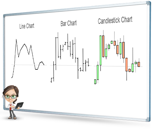
Once you have mastered the line and bar charts, you can graduate to the candlestick chart which will be easier to understand as it is similar to the bar chart. The vertical lines of both charts illustrate the trading period's price ranges, while the body of the candle uses different colours to represent the market changes of that time period.
The Candlestick Charts Detail:
Dating as far back as the 17th century, the Japanese began using the technical analysis to trade on rice, although quiet different to the US version created around the 1900s their principles are similar.
In order to start creating and reading a candlestick chart, one should know that the data contains highs, lows, open and close prices.
The "colored" portions are called the "body". The long thin lines above and below the "body" represent the high or low ranges and are also referred to as either "shadows", "wicks" or "tails". Should the lines be placed at the top of the body this will tell you the high and close price, while the line at the bottom of the graph indicates the low and the low's close price.
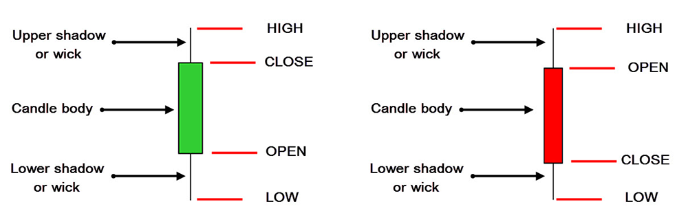
The colors of the candle body do vary from broker to broker, where they could either be green or blue, illustrating a price increase or red being a decrease in price, or hollow candlesticks is where the close price is higher than the open price which will indicate to traders to BUY. Filled/colored candlesticks where the close price is less than the open will indicate a SELL position.
-
Forex Basics - Course
-